Creating the Branding Guidelines Book:
To gain some inspiration for my guidelines booklet, I looked at some other brands that have been made a guidelines book for their brand. I looked at E4 and NASA's showing different variations of guidelines. This gave me a good idea of what to put into my version and made me thinking about ways in which I could lay it out. Below are some images fro there guidelines.


Company ethos:
This rebrand is
aimed to appeal to a western audience through selling a sense of Japan and its
values (Yamafo-Damashi). The brand has changed and adapted to fit in cultural
values of the west. This is done through the brands name being adapted and
aesthetic changed. The aesthetic has been adapted to create Japanese feel, but
adjusted and changed for westerners, being more chic, stylish and endearing
(Iki). I created a new slogan for the brand, ‘Clean Living = Clear Mind’. This
reinforces the name of the brand, focusing on the idea that with a clean home
you will feel generally better and more at peace (Wa). The concept of the
rebrand takes a dull tacky aesthetic and elevates the brand through the new
identity and packaging. The set of products and launches to a new target
market, appealing to them through trusted Japanese values with aesthetics
appealing to westerners.

Logotype:
This logotype is
the key element in SuperClean's visual communications system. Through
consistent and repetitive use as a signature device and design element in all
of SuperCleans's visual communications, the logotype becomes a visual staple
which identifies to western culture, but symbolically embodies Japans cultural
values.In the logotype,
the letters S-u-p-e-r-C-l-e-a-n are reduced to the most neutral form. The
strokes contrast in weight Super being in Bold Italic and Clean being in
Ultralight, evoking the qualities of tidiness through the word clean looking
more fine and delicate. This is matched with Japanese characters translating
the name underneath, this highlights the products Japanese roots. The logotype
should never be altered or distorted in any way. It must not be re-drawn, but
rather reproduced using the adjusted sized logos in the design manual. Guidance
for the use of the logo in colour variations is contained on the following
spread. The correct colour for use in the SuperClean logotype is shown
below.This dark shade of mint contrasts well with the white letterforms. The
colour reflects a minty fresh and clean mood. This white logotype can only be
used as a logo when against the mint green or the other colours for the
packaging labels, which will be discussed more later on in the manual.

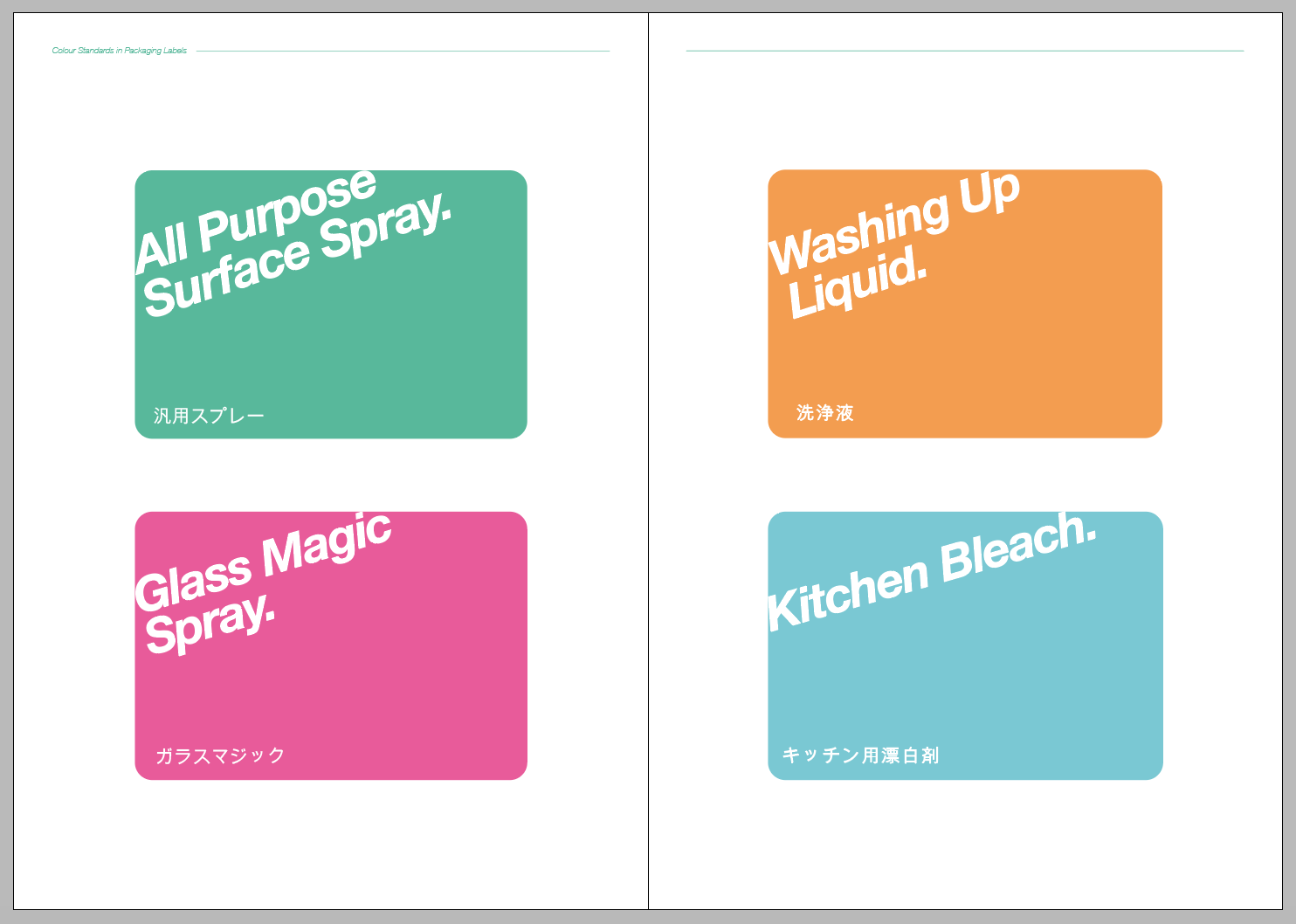
Colours:
The
Colour Standards are all approved to be placed with the logotype. These colours
are engrained within the brand and each represent a different product. The
colour values are found below in relation for applications of print and web.
These colours work as a set and should not be altered or put with any other colures.
Dark mint green: This green is the brands staple colour. Relating to themes
such as fresh and clean, this colour is perfect to contrast with the white
logotype. In the product range this colour is used for the ‘All Purpose Surface
Spray’. Popping Pink: This exciting, vibrant pink connotes a fun and clean
mood, ensuring to pop out on store shelves. In the product range this colour is
used for the ‘Glass Magic Spray’. Rich Orange: This rich warm orange creates a
relaxed and happy mood whilst ensuring to look clean and new on store shelves.
In the product range this colour is used for the ‘Washing Up Liquid’. Soft
Blue: This light soft blue creates a relaxed and chilled mood. In the product
range this colour is used for ‘Kitchen Bleach’. On the following page the
colour standards are shown within the packaging labels. The type is similar to
the logo, using Bold Italic although adjusted, via rotation to create an effect
as if the type has been sprayed across the label. I also created
standard configurations for SuperClean’s identification. One logo is a
simplified version including only the Logotype, the other includes both the
logo type and the brand ethos, Clean Living = Clear Mind.

Final Packaging label design:
The coloured
labels are shown in context here. This shows the placing of the labels on the
bottles, these should not be altered. These are also the new bottle shapes for
the products, all slightly smaller than the standard kitchen appliances
bottles. This is done to create a better sense of consistency across the brand,
as well as appealing to a cuter gift market not just household appliances.
Within this are specifications in relation to the negative space around the
label. On these Small product labels there should be a 0.5CM perimeter allowing
the logo to breathe. This should not be altered. They have been adjusted to
become a more square shaped, better for the bottle sizes as well as the colours
changed.

Logotype Sizing/ Uses:
Here is the
logotype enlarged onto a grid format. This is in case the logo needs to be re
scaled for larger applications. Following this is incorrect uses of the
logotype. No effects or changes may be made. The letterforms should be filled.
Next to this is the logo at different adjusted sizes, in proportion, making it
easier to not manipulate the type incorrectly.


Typography:
Helvetica Neue Bold
Italic:
Helevtica is the
most nuetral and legible type. The Bold Italic variation has been chosen for
the ‘Super’ part of the logo. Conveying a link to cleaning through the use of
the italic, as if the text has been sprayed on relating to the products in the
SuperClean range. The type has tight kerning, leaving thin gaps for the
single letterforms
to breathe and be legible.
Helvetica Neue
UltraLight:
Helevtica UltraLight
has been used in the ‘Clean’ part of the logo. This design decision has been
made to contrast with its older brother, Bold italic. The much thinner strokes
connote a fresh and clean mood, highlighting the ethos of the brand. Much like
the bold part of the logotype the kerning is tight.
Arial Unicode MS
Arial Unicode MS is
used for the Japanese type. This type matches well with the neutral aesthetic
of Helvetica. With a regular stroke weight this compliments the other stroke
weights creating a variation of line. The kerning on the type allows for much
more space around the letterforms, this is done to ensure the type is legible.
Japanese characters are alot more complex than our letterforms and can be misread
if the kerning is to tight.

Finalising and
printing/binding:
To print this
booklet I wanted a simple but effective way of binding the pages. I have done
lots of bookbinding projects in the past, and felt although it would be nice to
hand bind the project it would take up too much of my time to stitch it in the
way I would want to. To solve this issue, I simply bound the book by stapling
it. I felt this was more appropriate as it would be the kind of booklet format
a company would receive after a rebrand. When printing the booklet I was
limited in the stock I could pick, as I was printing double sided. I ended
using an Olin Regilar 200 gsm for the stock inside the book. Although I like
the weight of this paper, it did print block colour not so well, leaving me
with not quite as clean colour outcome as I would have wanted. Saying this, it
does not effect the booklet too much and was a factor out of my hands and
something uncontrollable that is the printers fault. This didn't effect the initial
aesthetic of the booklet as I used a different stock for the front and back
cover: I used Matt 245 gsm. This gave my booklet I professional look with the
matted, thicker stock. As it wasn't double sided and printed on the better quality
printer, this came out look very clean and just as I wanted it. After trimming
and stapling the pages together it was now time for me to complete the booklet using
the electric guillotine, this creates a clean cut line leaving work looking
professional and to an industry standard.
No comments:
Post a Comment