Linking Practical and Theory:
This
project focused around branding, specifically how brands change and adapt to
fit in with cultural values round the world. My essay allowed me to gain knowledge
from a range of sources and academic writing, discussing theories and designer’s
opinions relating to branding on a global size. This gave a clear understanding
of globalisation and how brands adapt for an international market. My practical
project took what I had learnt from my essay and demonstrated design techniques,
through the rebrand of a company for a new cultural group. I tried to globalize
a brand taking it from East to West, two vastly different cultures.
‘Logically then, different cultures will interpret signifiers in various
ways. The concept of how something is viewed is the interpretation of the
signs, terms and symbols – and this interpretation is culturally dependent. In
relation to the design and marketing of brands, this stresses the importance of
understanding culture, and respecting values and customs so as to ensure not to
offend.’ This quote is taken from my essay and discusses cultural
interpretation. Throughout my practical this was something that I had to
consider carefully. In particular, when creating my packaging labels, I needed
to ensure the Japanese type wasn't taking over the image, and therefore
connoting that the product is imported, instead of being produced for the
western market. To ensure I was creating the right message I took the design
decision to keep to Japanese type in a much small type size. This then hinted
at the brands relation to Japan instead of suggesting it was made for Japan.
My practical heavily relates to semiotics, ‘the signifier is a signs
image as we perceive it… Shapes, colours and lines are all signifiers. The
signified is the associate concept.’ The quote links in with the interpretation
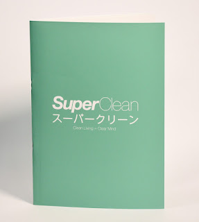
of my logo. The name, language and style of the the logo has all been changed
to appeal to a western consumer. Changing the name so its relatable in English,
as well as adapting the colours to stand out on the shelf and not connote Japan
as much. Although the majority of westerners don't speak Japanese, the type in
my logo Relates the product to Asia due to the translated name in Japanese characters.
This Japanese type breaks up the English logo, with the name above and the
slogan below. This then highlights it's a brand for the English market and
makes the Japanese type feel more like a pattern referencing Asia, rather than
intended for reading. Saying this I have still considered ethics and checked
that my translation of super clean is correct. I have done this to ensure not
to offend Japanese purchasing in the western market.
‘Packard, V.
(1957) discusses one way in which brands can relate to local culture, through ‘selling
a sense of roots’. Here he stresses the importance of customs, tradition
and heritage, and how companies can capitalise on this when branding products’.
This was one of the ways that helped me to brand the product. The brands ethos
is clean living = clear mind, within this, the audience gets sold a sense of Japan and its values
relating to Yamafo Damashi. The aesthetic of the brand has been adapted to
create Japanese feel, but adjusted and changed for westerners, creating chic,
stylish aesthetic relating to the concept of iki. As well as this the idea, the
ethos that having clean home will make you feel generally better and more at
peace linking to Wa, another Japanese concept. Here I have used Japanese values
to appeal to western consumers. The consumer trusts and is buying into the
product due to these traditional Japanese values. This could also be seen as
depicting the east from a western perspective relating to orientalism,
discussed in the essay. ‘Orientalism is directly tied to the western imperialist societies that
created it. It encompasses the power relationship between the West and East,
with the West trying to claim dominance through depictions of the East.’ It
could be argued that I am depicting the east here for success in the western
world, but that is only to benefit the original Japanese brand.
I also tried to
sell a sense of power the the consumer, another of Packard’s persuaders
referenced in my essay. By stating that with clean living you will have a clear
mind, this appeals to the consumer, empowering them, and inferring they will
have more control over there life by buying into the brand.
These examples
demonstrate how both the practical and theoretical side of my project
intertwine with one and other. Without the theory I would not have had
knowledge of branding for international purposes and feel I would have created
a much less engaging project.


