Brief:
During Creative Convos week, an ex student
Kieran from Condenast came in to set us a brief on behalf on Wired UK magazine.
The task: We’d like you to create assets to promote the online long read ‘UNFINISHED
SYMPHONY’ as found in WIRED UK Mar/ Apr ‘19. Consider this an advert for the
article - an opportunity to promote the content previously exclusive to print -
with the objective of sending an audience to the WIRED site to read on.
Considerations:
Promotion
Reflect brand
Assets are often
repurposed to sit elsewhere
Draw people to the
article
Deliverables:
Instagram post
Instagram story
Mandatory
requirements:
Follow Wired uk
aesthetic
Use brand typography
Do not share assets

Research:
When initially
researching, I wanted to find good examples of fast pace moving image that
captured the audience’s attention whilst informing them on a subject matter.
Some of the best examples I saw of doing this was from Kyra TV. This ‘new age TV
network’ run by a group of young creative is leading the YouTube TV show
scene, creating new concepts for for young presenters. In there most popular
show, PAQ they introduce guests on
the show with a couple of second set of photos of the guest mashed together with
moving typography. This short but sweet moving image really stands out, moving
quickly, using fast changing and flashing images with bold strong typography.
The audience is quickly informed through range of imagery giving context to the
guest.


Looking at wired instgram posts and stories:
To gain a better
understanding of how wired promote their work, I researched into this going
through Wired UK Instagram. On here I found some great examples of how their
work is presented and promoted. Similar to Kyra TV, fast pace parts of the
promotion enter and leave the composition allowing information to buy digested
quickly before the more information is placed into the composition. These
moving image pieces are constantly moving with all different sections having
small animations, whether that's type being typed out or images flying in all
direction, all coming together to create a clean composition that is still a
second before the animation disperses again. This was really helpful showing me
the aesthetic and level of promotion they use.


Ideas:
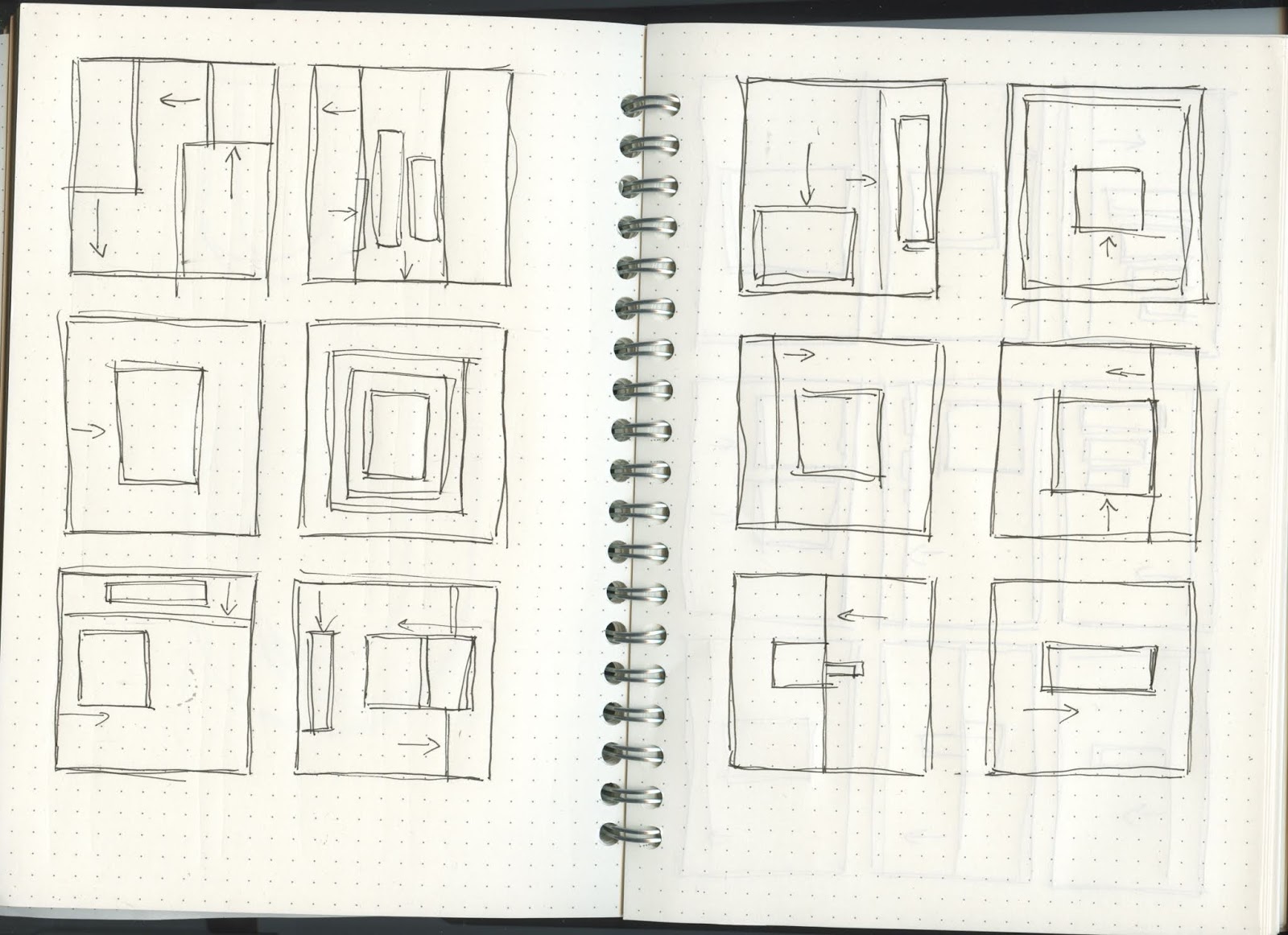
When
generating initial ideas, I went straight to sketching giving me an idea of how
I wanted the assets the be animated. From my research I intended to use techniques
found on the wired social media pages as well as inspiration from Kyra TV. I wanted to be able to create
the animations at a fast pace. To do this I intended on using sliding panels.
These could then be animated from all directions to reveal the black text on
the white background. This would be a fast and effective way of making the
piece constantly changing with the effects which outcome which is simple but
looks complex. I then intended for imagery to use this same technique to reveal
imagery assets as well as fast flashing imagery. For the Instagram story I
intended to use the same technique, but in a more simplified way. Her I would
briefly show a few of the more exciting assets, just to give a taster. The
Instagram post video is the main piece; these three mini stories support that
post.

Assets given to us:


Whilst developing this idea, the first aspect I thought about was the assets from the article and how these could be developed to enhance my video. To do this I edited some of the imagery slicing it up to create more interesting compositions when moving, as well as photo manipulation and adding white and black outlines the the imagery to make them pop more.


view gif here:
I made the gif on Photoshop using the timeline tool, I then inserted this into premier. Originally the asset this was created from, was a large tile style piece with loads of these abstract paintings. I screen shot them, making them pixelated. Luckily this worked in my favour, as this created a glitch like aesthetic. Each image appears for 0.1 and contrasts nicely when placed on top of the slower pace of the other video.

Developing
the idea, I thought about the typography, I considered using colour but felt it
wouldn't be as powerful in comparison to black on white. This worked especially
well due to the dominating Brutal font, being clear and legible, and easily
visible on a phone screen. I spent time experimenting with different solutions
and ways in which the imagery can come in, and at what pace. I tried to make
the video seem ordered and equal. Making images enter at exit at the same time
but from opposing sides of the shot. I felt his created an almost pulsing
effect in the film. I tried layer images and playing around with splashes of
colour. The gif embedded on the computer at the end of the advert works well,
adding a new dimension to the piece. I used similar techniques for the
Instagram story in less detail taking a more of minimal but intriguing
approach.


This aesthetic is matched with Massive Attacks ‘Paradise Circus’ song. I tried to edit consistently with the beat moving assets in time with the some. the video also works just as well without sound, an aspect I considered whilst designing as many social media users wont turn sound on.

instagram stories assets:


watch the videos here :
instagram post: https://vimeo.com/334521971
instagram stories:
1. https://vimeo.com/334522820
2. https://vimeo.com/334523463
3. https://vimeo.com/334523767
4. https://vimeo.com/334526561
instagram post: https://vimeo.com/334521971
instagram stories:
1. https://vimeo.com/334522820
2. https://vimeo.com/334523463
3. https://vimeo.com/334523767
4. https://vimeo.com/334526561
production:
In the production of
making this I used premiere pro, as my video editing software. Using this as my
animation tool as well meant I really needed to consider what was going where
and and what time, to ensure it ran smoothly. This task was also matched with
creating and making all the typography on the programme, which was time
consuming. Having done video editing before, the music plays such a key role in
setting the tone and pace of the video. It was challenging making all of the
elements come together.

Evaluation:
Getting more of an opportunity to work on
premier pro made this project so enjoyable. I really liked how straight forward
this project was. Being given the assets and having free rain to be creative
using moving image was key to the success. This helped develop my skills on
this programme as well as create assets for social media, formats like square
and long portrait to use to create video was also new for me. To improve this project,
I would have ensured some of the typography was more legible, I say this as some
of the type was vertical and making it hard to read in a short amount of time
due to the pace of the video. I was working to a deadline which works really
well for me, and the assets were finished in time. I would have made the Instagram
story assets more complicated like the main post, but with other projects on
and a time scale to work to a decided on taking a minimal approach with them letting
the main post take centre stage.
No comments:
Post a Comment