Brief:
In this research task,
investigate into a chosen subject area: Jury Service. Research in depth considering all aspects of
the subject. Let the research guide you to create graphic design solution.
Considerations
Jury service is for a
large audience
This is a government run
programme
Serious tone of voice
Mandatory requirements
Create a fitting
graphic design outcome
Research brief
Research:
The interest in this project
came from sitting on a jury over the summer period. I was involved in a big
case and found the experience incredibly interesting over the 4-week timespan I
was in court. This sparked a big interest for the subject and gave me a huge
amount of primary research.

History
Having been a part of the process I researched
into the history of jury service. Looking at History of trial by Jury Straight away this research surprised me,
informing me of how long the process has been around for and how it has
developed into what we know today.


What you expect to
do:
Having engaged with others
who had also been jurors, I wanted to get a feel for other people experiences
and how different everyone’s are. This led me into some secondary research looking
at what people should expect on jury service. Having completed the process,
myself, I agreed with a lot said in the Metro
article 15 things to expect when you do
jury service. This made me consider the guidance I was given when starting
the process, which was minimal, jurors are shown a video explaining the process
when they arrive at court. Although this explains the process it lacks as piece
of information that can be looked back at.


How jurors get
picked:
Although having done
jury service I was still unsure as to how jurors are selected. Reading an
article from InBrief informed me of the selection process, and the
qualifications needed. Being able to do jury service is affected by your criminal
record and whether you have spent time in prison, as well as being registered
to vote and other aspects such as disability.


Blind and deaf:
Having looked into who
can qualify to do the service, the subject of disability hadn’t been answered. I
wanted whether this would effect the prospect of somebody disabled being able
to serve as a juror. After researching I found an interesting article Deaf or Blind people cant serve on Juries- Here’s
why the law needs to change. It
reads; ‘In the UK
and Ireland, for example, deaf people are deemed as “incapable”
of serving as jurors if they need an interpreter, since interpreters are not
permitted in the jury room. Blind people, meanwhile, are usually excluded at
the judge’s discretion because they can’t read the court material’.


Designing
for everyone:
From the
research so far I was particularly interested in the concept people being
randomly selected for the process. The huge target audience that jurors are
selected from completely varies on each case.
This means any aspects of design in relation need to be inclusive of
this huge range of possible jurors.
Inclusive design:
This lead
me on to researching inclusive design. This was a subject I found very
interested in due to the nature of precision and care taken in create inclusive
design that has to interact and communicate with all audiences.
Examples inclusive design
campaigns/ brands:
From this interest I researched
into good examples of inclusive design. Finding two brands that considered
inclusivity. These were a good example for designing for markets not as tapped
into for these brands. Examples include Its
Nice That's: Englands rugby team gets an inclusive new look courtesy of
onwards. As well as, Is this the most
inclusive fashion campaign around by Ruth
Hamilton. Both pushing and supporting inclusivity through campaigns focused
on gender and disability.


Further inclusivity
articles:
Knowing the concept of
inclusivity was going to play in key role in this project I carried on
researching. Looking at articles from the Design
Council about inclusivity. Reading ‘Accessibility ensures people with disabilities
can access the same information form a system as everyone else, and also gain
the same benefits.’ This was interesting
and lead me onto an article; How braille
typefaces for public spaces hopes to create and “inclusive” society. This
article made me consider creating something that could include blind people in
jury service.


Inclusive books references:
With the idea to create a
piece of informative inclusive design. I researched into what it is that makes
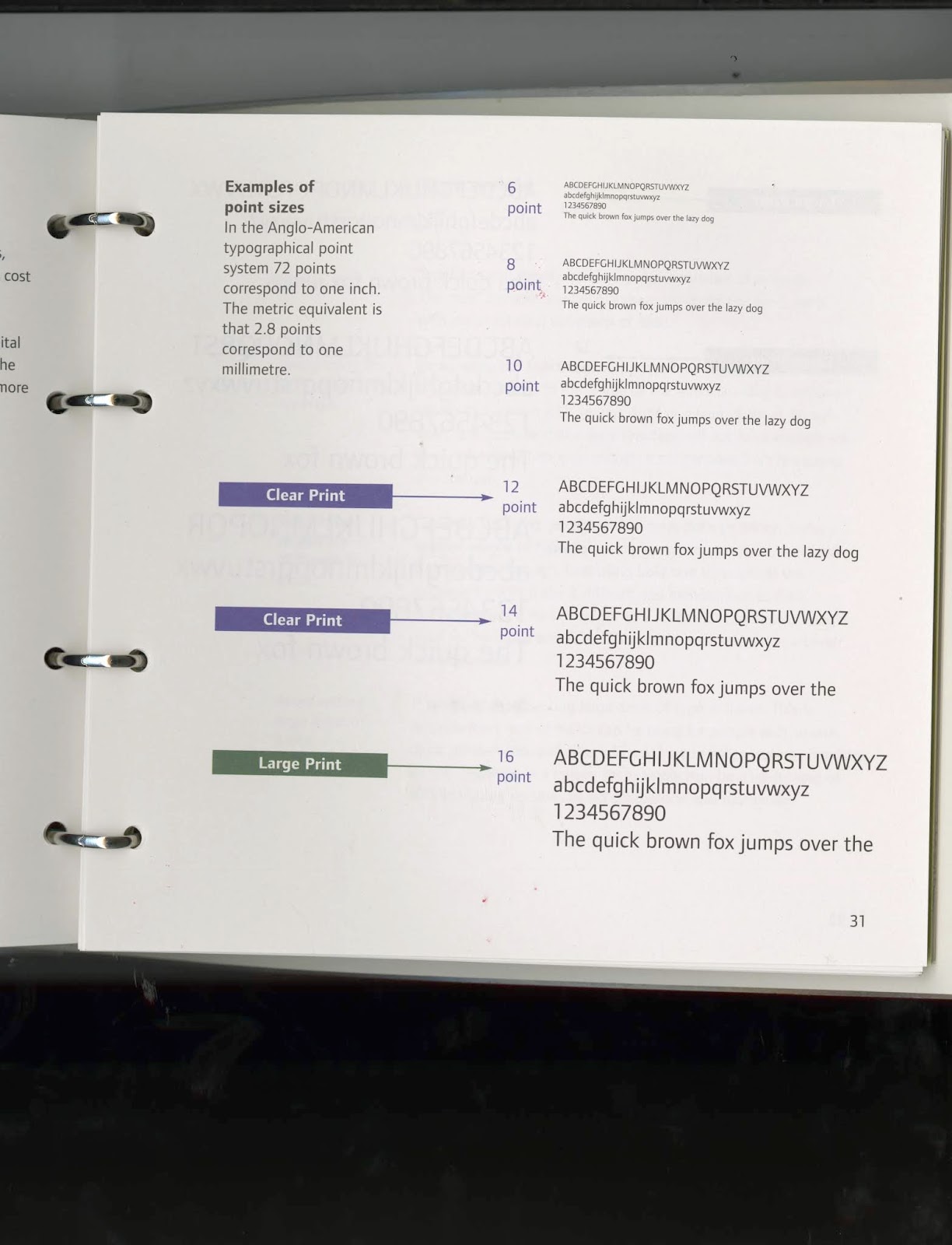
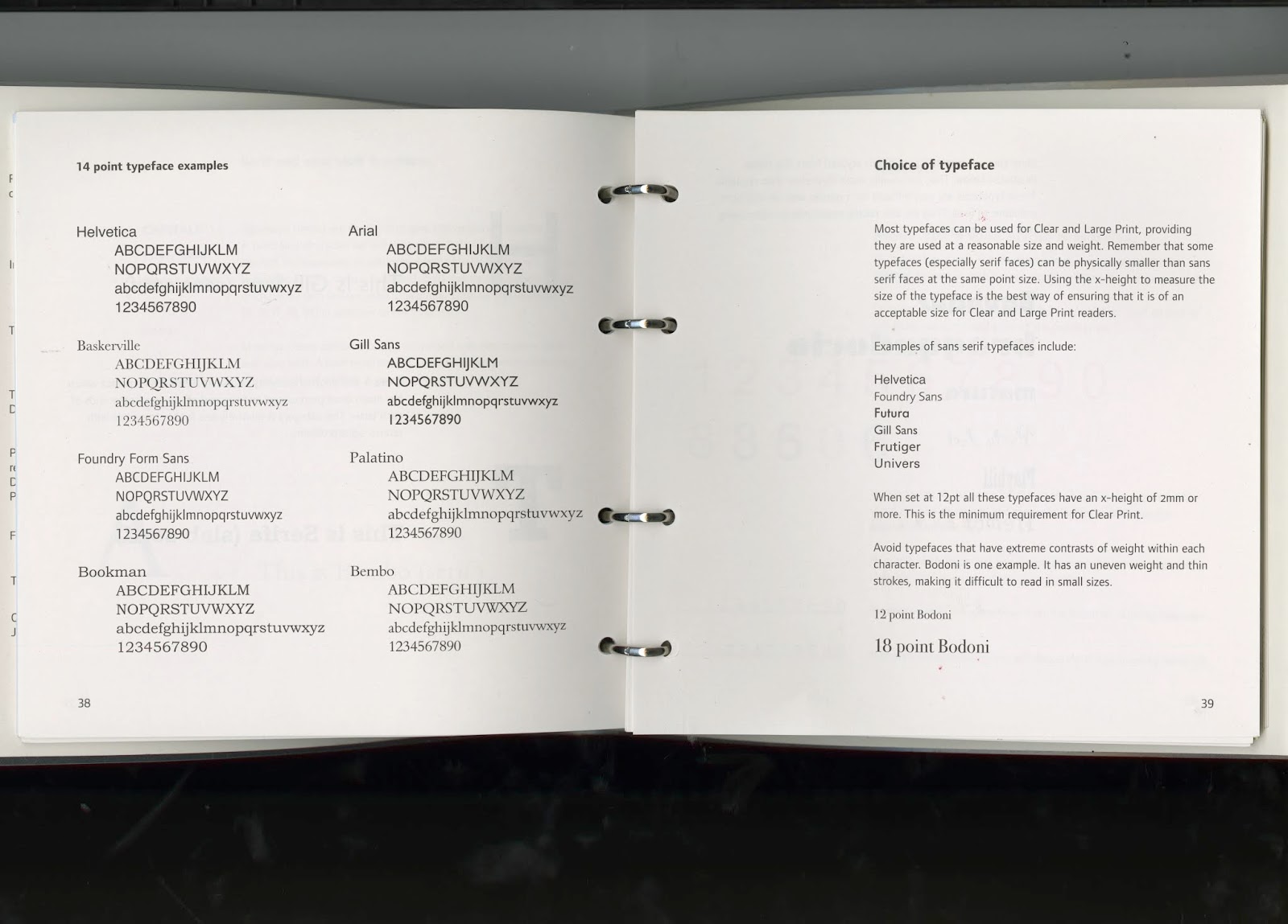
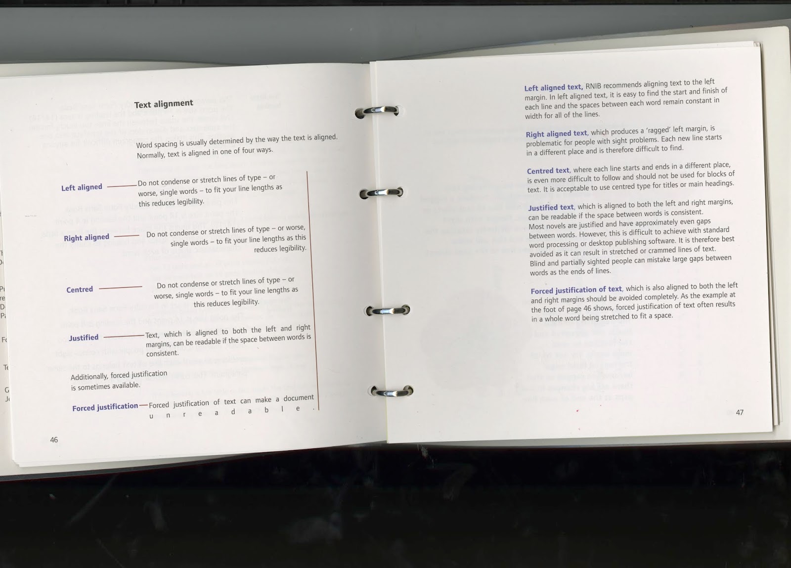
design inclusive. I took out 2 books. The first; Inclusive Design: clear and large print best practise guide for beginners.
This is joint publication between the royal national institute of the blind,
international society of typographic designers and supported by the design
council. This gave me an informed understanding of inclusive design. Gaining
key knowledge on colour and contrast, type size, typeface choice, alignment,
tracking proportioning etc. the second book; Sign Design Guide a guide to inclusive signage. I particularly
inspired by navigation from this book. Thinking about direction and use of
arrows.
Inclusive Design: clear and large print best practise guide for beginners


Sign Design Guide a guide to inclusive signage


Ideas: brainstorm
Moving onto ideas, my
research had already led me down the thought process of creating some kind of inclusive
piece of design. Saying this I still brainstormed coming up with other
propositions for the project.
Choosing idea:
After exploring other
thought processes, I felt my research had steered me in the direction of
creating inclusive design. Specifically, I would be creating a guide to jury
service. This application was chosen as the guidance during my time as a juror was
poor. Although you are sent a guide to jury summons, this conservative document
focuses more whether you are eligible to do the service, deferring the service and
confirming doing it. Although watching a video at the start of the service, the
process lacked in a document clearly explaining the process and something to
refer back to if lost along the process. This would be intended to be sent out
before the juror comes to court to familiarise them with the process and
hopefully answer any questions they have.

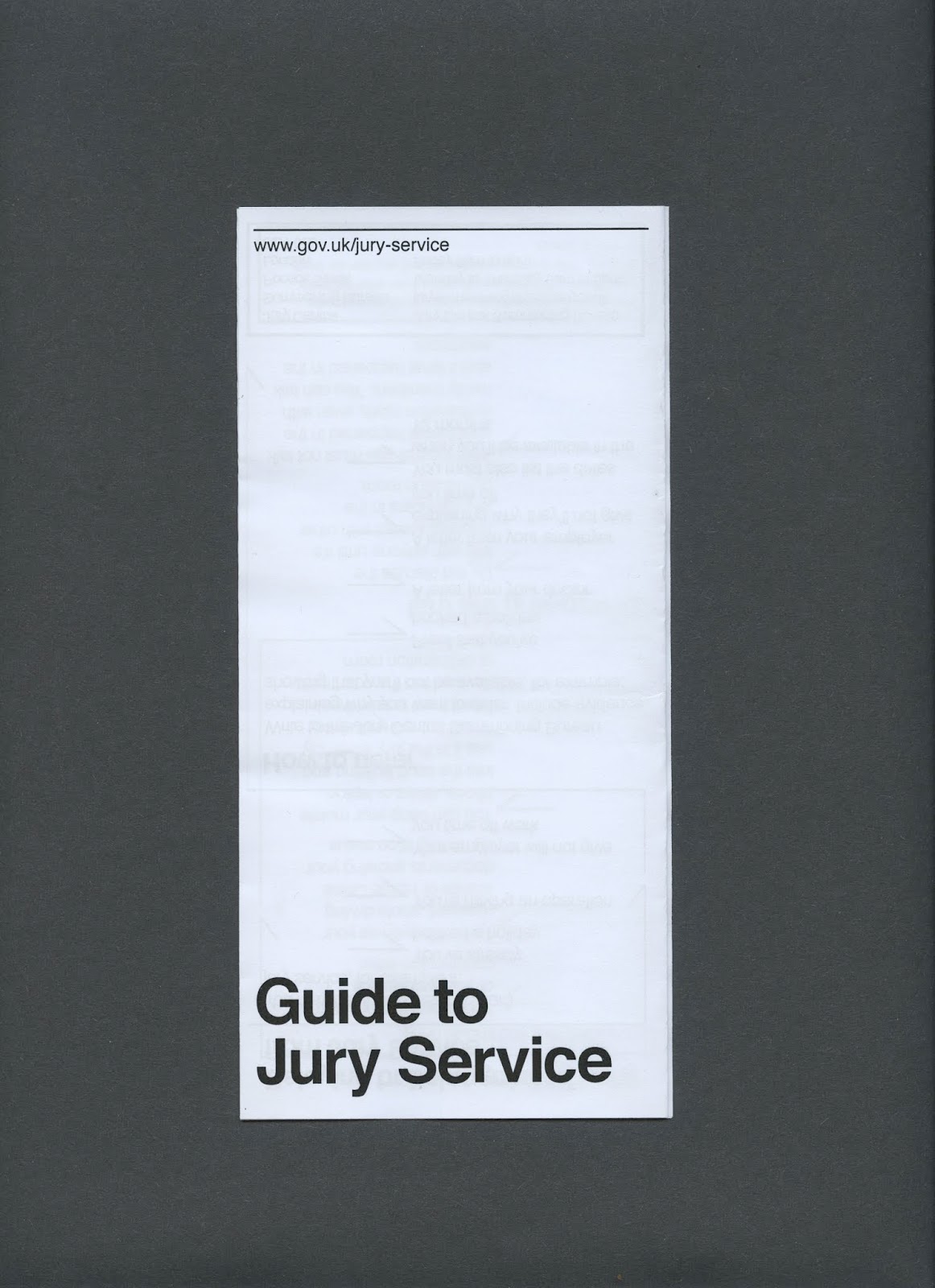
Format:
The
first aspect of creating this guide was deciding the format. I knew being a government
process, there would be a small budget. This therefore lead me in the direction
of creating a pamphlet. For this I had multiple options in the format of how I wanted
this pamphlet to be to be laid out and opened up. Having looked at the four
main options I felt a z fold would be appropriate. This was appropriate,
meaning I could print on a conventional standard a4 size. Not only this but the
automatically split the design into six portrait sections, informing me on the
space I would have for the information.

Information:
Imagery for this would not be necessary and
would only take up valuable space. The information for the the project was
found on the gov.uk. Although this information is available for the public, I am
creating this pamphlet with a huge target audience. This meant some of whom aren’t
familiar with technology i.e. the elderly, and therefore wont be able to access
it. The website goes into a lot more
detail. I was tasked with finding the important information, and sections I felt
necessary as someone who has experienced the process.


My notes:


Type experiments:
After being inspired by Inclusive Design: clear and large print best
practise guide for beginners. This gave me great direction for typography,
although I new a range of font applications I could use for this, it gave me a
list of the most inclusive types. During experimenting I tried 6 sans and 6
serif fonts. Although it was helpful ding this process I was almost immediately
settled on using Helvetica the most neutral font. Although not the most
exciting option it was the most suitable. The friendly aesthetic is the most
legible font at a range of sizes, working perfectly for this project. Not only
this but the government branding also uses this making it stay consistent with
the larger umbrella branding of government branding.


Layouts:
After making decisions on
format, type and having the information to put onto the pamphlet I started illustrating
different ways on which the document could be laid out. Although a simple task,
I found it harder than expected to create different solutions using only text
in a such a small space with so much information. Still, I experimented using
boxes to show section of text and how the could be placed. I spent time
thinking about ways in which different sections could be broken up to clearly state
points. I explored boxing techniques, using other shapes to break up or point
to the next section. This was trickier than anticipated.


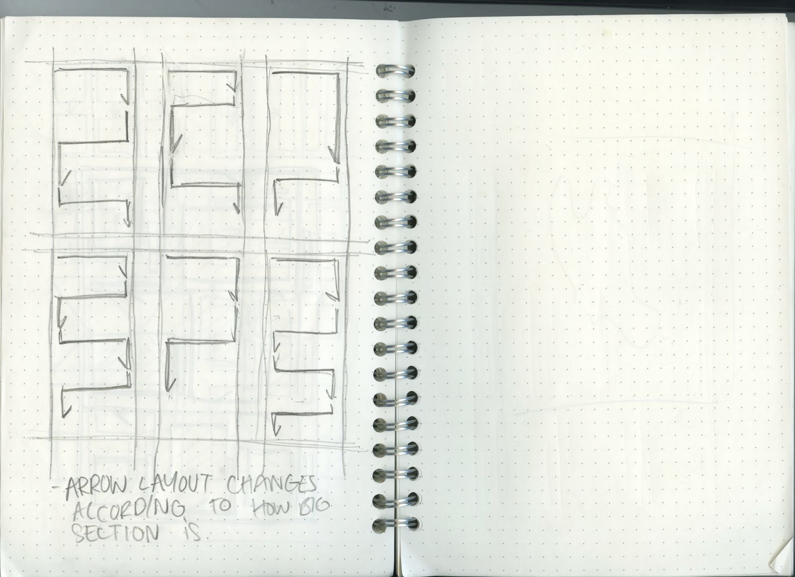
Wayfinding:
As mentioned when talking
about the layout, guiding the audience to the right place and splitting up
sections was key to the success of this project. To do this I felt using arrows
were most appropriate. A sign globally used that is inclusive for everyone to
understand only seemed right. Saying this, it was a matter of designing the appropriate
arrow. I sketched as many different forms of arrow I could come up with, giving
me abetter idea of what would work at the scale of the pamphlet.


Creating the outcome:
This left me to take the concept form paper to digital. Although this seemed like an easy task this was very time consuming ensuring every aspect of the piece stayed consistent with the rest. This was tricky at times due to the amount of information. For key information the audience should be aware of, I placed into black outlined boxes highlighting the importance. Within the sections I used the arrow shapes, but much shortened versions. The body text was kept to one side of each section allowing the arrow to point to each point, and create negative space. This made the composition breathe and was a key part in the design not feeling overcrowded and readable. In terms of typography I used size 12 Helvetica regular a legible size for the user. All the headings use a strong Helvetica bold size 18. Although knowing what to create, this piece of design took a lot of revisiting. Typography takes precision and time to get right, this was the case with this design.
Evaluation The outcome of this brief was easy to create. With the intention of being a government document I knew it would be suitable being printing on standard a4 cartridge paper. Creating a z fold out of this was easy and effective, making the process quick and feasible for government. Although the outcome was straightforward to create I felt the solution of creating a guide made complete sense. The success to the guide was down to the grid system controlled by the arrows. I feel this was a smart solution in breaking up section and creating a clear system to guide the viewer through the process


Evaluation The outcome of this brief was easy to create. With the intention of being a government document I knew it would be suitable being printing on standard a4 cartridge paper. Creating a z fold out of this was easy and effective, making the process quick and feasible for government. Although the outcome was straightforward to create I felt the solution of creating a guide made complete sense. The success to the guide was down to the grid system controlled by the arrows. I feel this was a smart solution in breaking up section and creating a clear system to guide the viewer through the process


No comments:
Post a Comment