Brief:
Explore and expand your knowledge and skills in custom type design. Over 36 days make a custom letter/number each day.
Considerations:
· Exploration
· Expand type knowledge
Deliverables:
· - social media assets
Live brief
Research:
To help inform me and give me an even better understanding of typography I read Just My Type. Just My Type, by Simon Garfield, starts off with an anecdote about Steve Jobs and his ‘world changing’ idea of offering a choice of fonts on home computers, but soon gets more interesting. This book tells the story of some of the most infamous typography, and was a great source of inspiration for this project.

I researched further into this finding their
website. Having a big interest in typography I knew I wanted to use this a
chance to explore experimental type. Not only this but I saw this as an
opportunity to make my design Instagram more active and bigger part of my day
to day life. I also knew this project would be a good way staying productive
and it was a fun task to break up a day with lots of other projects happening simultaneously.


I researched further into this finding their website. Having a big interest in typography I knew I wanted to use this a chance to explore experimental type. Not only this but i saw this as an opportunity to make my design Instagram more active and bigger part of my day to day life. I also knew this project would be a good way staying productive and it was a fun task to break up a day with lots of other projects happening simultaneously.

inspiration of previous entries:


ideas:
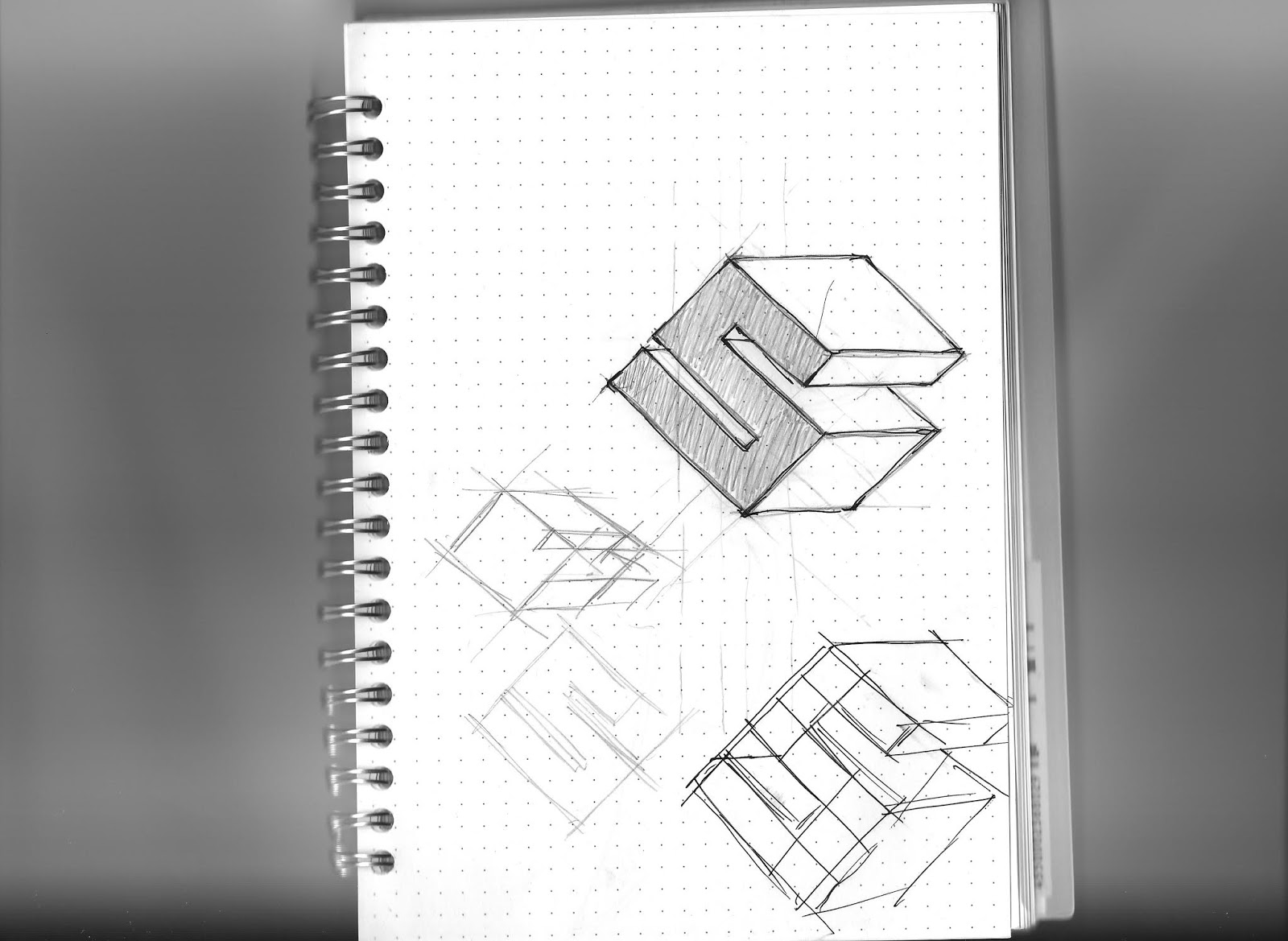
When it came to idea generation for this brief I didn’t want to be conceptual and saw this purely as an opportunity to experiment with type in ways I wouldn’t normally. This was due to me being quite strict in the way I approach type . With some letterforms I took a more conservative approach and started sketching on a dotted sketchpad creating a grid format, which allowed me to conform and break the grid. With other letterforms I took a relaxed approach and when straight onto digital format experimenting with creating forms out of purely shapes. On other days I would look at letters from typefaces I really like and work on ways of redeveloping the letters, working on experimenting with serifs, bars and stems. Knowing that I wanted to gain traction on social media through this project, made me consider how this work would be displayed online.
experiment with some of my favourite fonts:


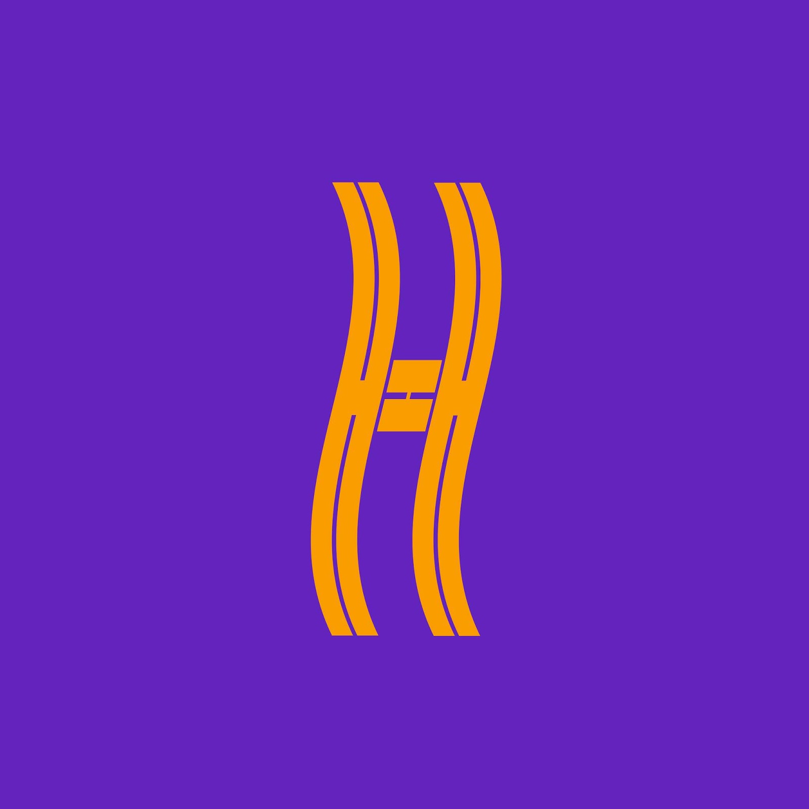
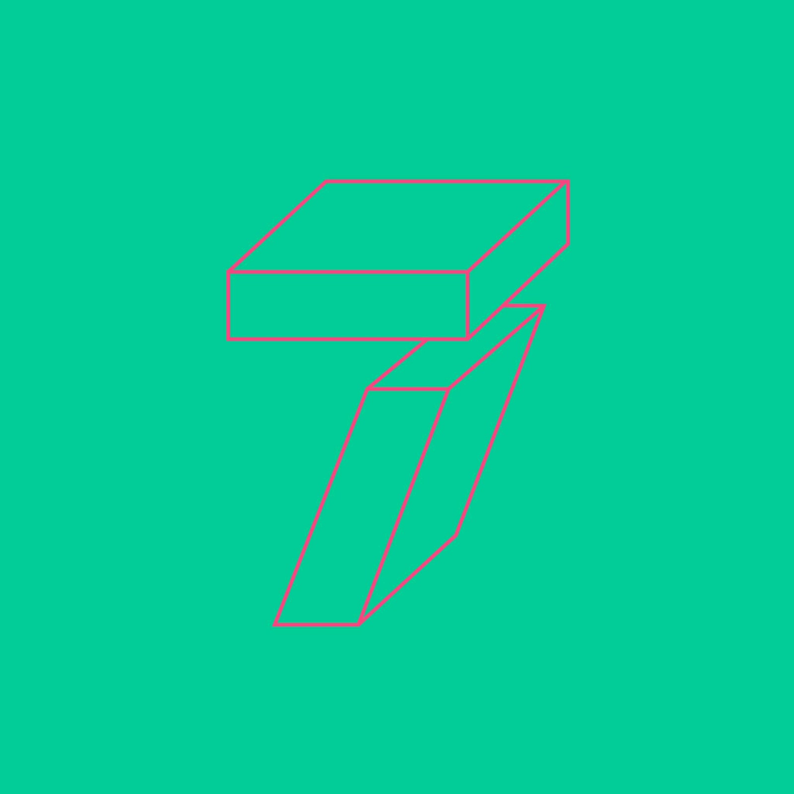
This led me onto the consideration of colour. Originally I had wanted to approach type project monochromatically and use dark grey on light, as I had seen the contemporary aesthetic this gives to Instagram accounts I had researched. This felt a bit dull, which is when I came across the idea to use an array of bright colour. Not only this but I had gained inspiration from a colour wheel which got me thinking about using contrasting colours from different sides of the colour wheel. The idea was to use a colour scheme across 3 letters so these looked consistent on Instagram. These same colour combos would then be flipped and used later on in the process so letters and background colours were switched. I though this would be interesting and create a cool colour gradient on my feed as the process went on.


Developing:
After completing the process I thought the colour wheel concept worked well and I got an encouraging amount of support for the project. Saying this, for me it was too loud and out there. This made reconsider my initial thoughts on using monochromatic colours. I knew I couldn’t re upload all the letters so I decided to archive the 36 days’ project. This then allowed me to try different colours by grouping the letters into nines and upload four posts. This worked really well and the letterforms looked much better in groups. I feel like this was due to the variation of design matched with continuity with the letters the same context, colour and size.


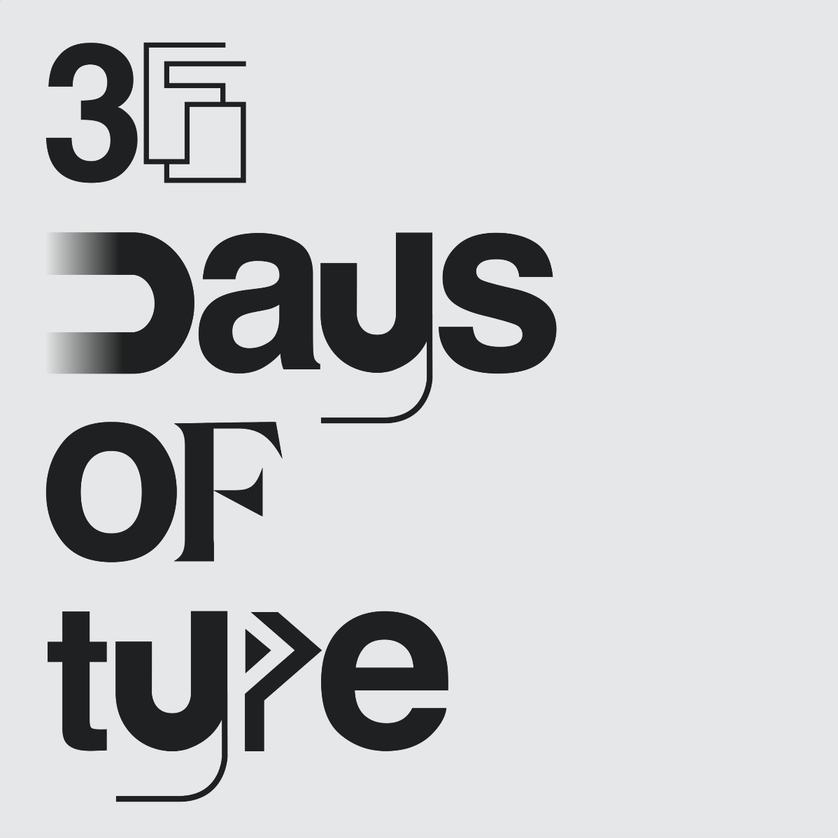
To take the project further I decided to create a logotype for the project using some letters create we and mixing them with the neutral Helvetica. To take the project a step further I decided use some of my favourite letter created and put the in context. I created logotypes using words that described the qualities of the letterforms, for this i thought about what name the typeface would be given. I think this worked really well and gave me clarity on the importance of this project and how these skills are very transferable to the real world and changing one letter for a logotype.


Evaluation
I found this project
very useful and productive. Not only did it expand my knowledge and skills in
relation to type, but it was a great way of keeping productive. Using this as a
task in the middle of the day to break up other design work. This ensured I
didn't get bored of a project a was a pleasant task to do that wasn't to
strenuous. Not only this but this helped me gain traction on Instagram, one of
the key reasons for starting the project. If I were to do this project again I
may have tried to experiment more with animation.
No comments:
Post a Comment