Brief:
This brief was a commission from a new events
company in Manchester. The brief initially asked me to brand the events
company. It was asked to create a logotype that reflects the brand. stage 2 of
this brief asked me to create the artwork for the brands first event.
Considerations:
·
Concept and
promotion
·
Reflect the brand
·
Trendy aesthetic
·
Stand out amongst
events
·
Eye-catching
and creative
Deliverables:
·
Logotype
·
Social media assets
·
Event poster a5/ a3
Mandatory requirements:
·
Use a pink
and brown colour scheme
Live brief
Research:
The research for this project
consisted of looking at a lot of current event nights branding. From this I gained
a better understanding of the kind of aesthetic and style already out there. It
also gave me a chance to see what was working and not. One of my main sources
of inspiration came from a club in Leeds called Wire. There simple use of
typography is bold and stands out against other competitors. This simple use of
bold Helvetica grabbed my eye so much that I wanted to find more examples to
explore this aesthetic and see how I could potentially bring this into blend
branding. I came across Huel, who also used this simple approach with Helvetica.


The successful event branding
that I looked at seemed to use a minimalist approach in term of logotypes. The posters
that I warmed to, tended to be complimented by shapes and patterns. These
mostly abstract artworks tend to relate to and represent the music or events
names. Some worked really well taking a 3d approach making the artwork capture
the audiences eye. Others took a bolder avenue using flat block colour, whilst
some used gradients to emphasise certain aspects of the piece. I felt the use
of gradient could be used as a technique to well represent the name Blend.


Brands that use similar colour schemes:


When first approaching ideas
for the project I initially thought about creating a clean bold logotype
inspired by my research. The main typefaces I experimented with where Druk and Helvetica.
Both sans serif types, they hold strong bold characteristics with thick
letterforms making the name legible to from afar something key for the brand,
grabbing the audiences attention when seen in public. I then went onto
experimenting using different weights and ways of distorting the logotypes.


What I sent to the client:

Developing:
Following my research, I felt
that using Helvetica was most appropriate, being the most legible and most neutral
approach. Whilst experimenting Helvetica I found the italic bold version most captivated
me. The forward tilting letterforms suggest a future facing brand. I then went on to developing this using the
outline of the type. This worked really well when I kerned the letterforms so
they were slightly overlapping. I then used tools to make this into one shape.
This worked really well encapsulating the name blend well by blending the
letterforms together so it is one shape. The Helvetica is key here and although
the letterforms are merged together the logotype is still legible. Using the outline italic Helvetica
blended together was appropriate. This allowed the logo to work well across lots
of formats. I also made the design so the colour could switch between
colour. The brown logotype, which worked
against the pink background, or a pink logotype better for headers and posters
if the background colour isn’t the brands pink.


Finishing the logo allowed me to move onto cover photo for the social media Blend page. This was simple and although I experimented briefly it was obvious to go for the simple route and follow the design scheme of the logo exactly, using a bold italic Helvetica in brown outline on a pink background.


Poster initial designs:
When
initially being given the task of creating the artwork for blends first event, I
got briefed asking me to follow on using the same aesthetic and approach I had
taken for the branding. From this I approached the project from a typographic aesthetic.
I knew I wanted it to highlight the branding, so the brand became more
established in Manchester. I felt the best way to do his was to experiment with
the logotype and different ways in which this could be placed to structure the
piece. The mandatory requirements fro this part of the brief changed. I needed
to incorporate all the correct information as well as one artist logotype. This
was slightly challenging as I needed to adjust there logotype so the colours of
the artwork didn't clash. This was also a struggle as I didn't want their
logotype to overpower the blend logotype.


When
designing the poster I took inspiration from my research and looked at ways in
which I could incorporate shape and line the create an architecture for the
piece. I experimented with a range of
grid formats. Doing this helped me whittle down what worked and would read
easiest to a walker by. During this experimentation period I also looked at how
to colour could be used and what worked best to ensure the poster caught the
audiences attention whilst conveying the information quickly. The client felt
some of these designs were overcomplicated and although he did like them, he
felt they needed to be pulled back to a more minimal approach. A similar
approach was taken with the social media cover photo for the events and events
page.
Developing:
When developing the poster, I was asked to approach my previous designs with a more minimal approach. The client decided on this version to develop. I agreed and felt the composition was the strongest, drawing the audiences eye straight to the information placed on the left hand side. This worked well, as I used a filled type making the brown type jump out against a clean white background. Above this the blend logotype is placed, working well in pink as talked about above. At this point it was a matter of experimenting with the artwork around the skeleton of the line up of the event. The logotype of an artist in the requirements for this brief sat nicely in with the rest of the lineup, not overpowering due to alterations of the colour. I then received similar feedback of making it more minimal. Although I felt this would take away from the punchiness of the poster and didn't shout Blend I could understand the perspective of the client wanting a clean and digestible poster that wasn't to busy.


I made some final adjustments
to the design. Firstly, removing the rotated blend type that was enlarged opening
up negative space and allowing the piece to breathe. I then played around with
the overlapping date at the bottom which morphed into a simplified version
running one section of the page allowing for a more stripped back artwork. On the
right side of the poster the semi circle was kept but adjusted, I felt this
worked well balancing the artwork out and allowing the logo to be shown on its
original form brown logotype on pink background. The cover photo for social
media took the same approach as the poster. This layout was condensed in the
same style to keep consistency across the event branding.


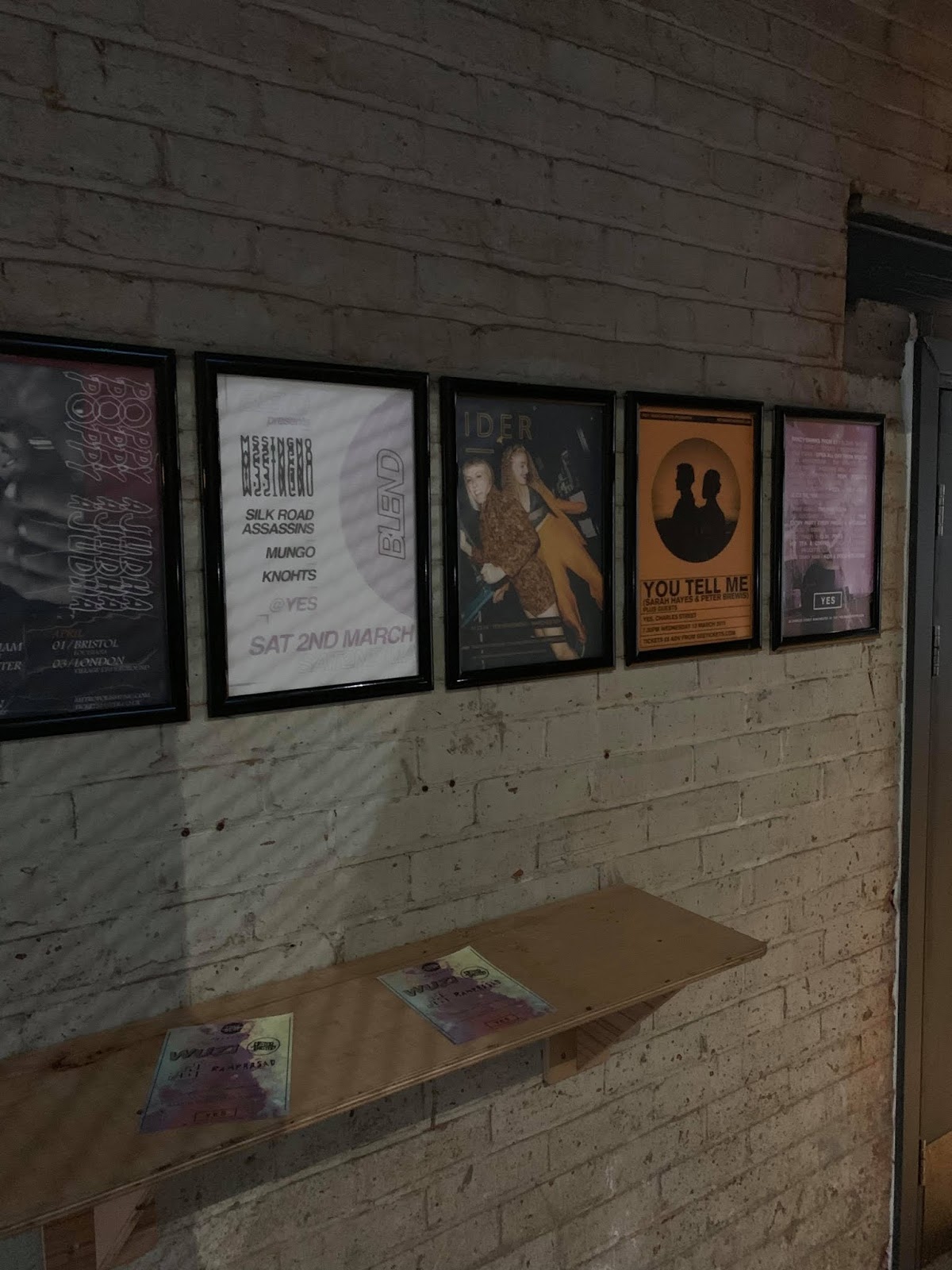
Production:
The production of the
artwork was done by the client. I was asked to create pieces for a3 and a5
sizes. The a3 where printed and posted around Manchester and ‘Yes’ the venue in
which the event was being held. The a5 version was for the thicker card hand-outs.
This was all done by the client. The cover
photo for the event was posted on social media to create consistency with the
poster.


Evaluation
This project was a
success and the client was very happy. The event sold out so I felt my design
had done the brand justice. I was happy with all the design work done and feel
as if I created branding that reflects the company and the people running it.
If I could do this project again I would not have given the client so many
options to choose from and would have given three stages of development
instead. Saying this lots of development was needed to create a visual language
for the brand and I felt I was successful in doing this. This brief taught less
about design and more how to deal with clients and making changes to work.
No comments:
Post a Comment