In this D&AD competition
brief Heinz briefed us, specifically asking our designs should use: the brand
tagline ‘It has to be Heinz’ facilitate a conversation between the past and the
future. To continue as the most chosen brand, Heinz needs to establish itself
as the main event. How can Heinz convince people that their favourite foods can
only be enjoyed with their favourite ketchup? Celebrate the 150th anniversary
of Heinz, and spark the next 150 years of brand love.
Considerations:
has to represent Heinz well
why Heinz should be an everyday choice
how has the last and next 150 years included Heinz
eyecatching and memorable
Deliverables:
A moving image advert
Mini design boards for D&AD
Mandatory requirements:
Have to follow Heinz branding guidelines
Research:
To gain inspiration for this project I tried
to remember some of my favourite and most memorable adverts. These include the John
Lewis Christmas adverts, all telling compelling stories that captivate the
audience. Contrasting with others like 118 118 creating a comedic and memorable
style of advert.
The Lemon:
This Volkswagen ad from the 1960’s was one
of my first sources of inspiration for this project. It immediately jumped out
at me purely for how irrelevant a lemon is in comparison to the product. This
left me thinking about how I could market Heinz ketchup uniquely and make the
consumer remember the advert.
Red bull adverts:
These contrast with animations which create different moods and can change a concept vibe and aesthetic completely. Red bull has done this over a long period of time. There unique styled adverts bring a good sense of humour matched with a political sketch aesthetic which makes the brand automatically recognisable.
Alessandro Novelli:
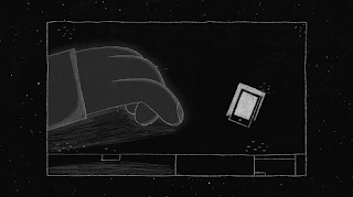
These are some stills from one of Alessandro
Novelli’s animations. I found whilst researching into animation style. His
aesthetic very creative, using a simple yet refined aesthetic, the use of thin
white strokes on a black background made the piece stand out and unusual. With
great story telling and a good pace to the animation this showed a well thought
out moving image piece; clean, concise and individual.
About the main judge for D&AD:
Ideas:
Initially this brief really appealed to me, not only do I really love the product, but I saw the opportunity the work
with moving image. Specifically, I saw this as a chance to shoot a full advert
using industry standard equipment. After toying around with a range of ideas,
the chosen concept behind the advert was based on ‘a long journey to find Heinz’.
This was a brief story board of the basic premise; after making a traditional British
breakfast, the character realise he/she is out of ketchup and goes to the
corner shop, only to be met by no ketchup again, this then cuts to multiple shots
from the same distance of the character walking through different environments
and terrains just to get to a store with ketchup stocked. Unfortunately, I was
not allowed to rent out the camera equipment; being a gimbal and high quality camera.
This completely swayed me of this idea as I only wanted to shoot this if it
could be to an industry standard.
Moving on from this, I started thinking more
about the tagline Heinz had provided, ‘it has to be Heinz’. This made me start
thinking about the everyday things, that we have do as humans of the target
market: western consumers. For example brush our teeth, wash our hands etc. Being
inspired by the Volkswagen advert I wanted to create a moving image piece that
shocked the audience. A lot of things had already been done with Heinz, as the
brand is very established. This mad me want to create something that would
shock the audience and would stand out in their day, just like the Volkswagen lemon
advert had done to me when I first saw it. Instead of creating an industry level advert
using cinematography I decided on playing on the idea of brushing your teeth. This
worked well as it's a ritualistic part of your day, just like using Heinz should
be a ritualistic condiment placed on the dining table. It also hopefully has an
element of humour, that who knows, maybe Heinz will have a toothpaste flavour in
100 years… To execute this idea, I felt it would be to graphic and disgusting
using realistic camera. To solve this problem, I felt it could work as a
sketchy stop frame animation. To save myself a lot of time, I quickly shot the planned
out scenes of the character getting up and doing his normal routine of brushing
their teeth. I then used this as my
basis to trace on top of. This saved me a huge amount of time not free hand
drawing over 250 frames.
Crit:
After discussing this will
class mates, and explaining the situation in regard to not getting the
equipment I wanted. I decided that the creating this animation was defiantly a
good route to go down. It would give me an opportunity to work with a medium I
am very familiar with but having not done much illustration recently, I felt it
would be a good project to show how multidisciplinary I am in my portfolio.
Developing ideas:
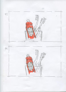
When sketching the frames, I wanted a loose
feel to the animation and a real sense of movement. I achieved this by being
very loose with my drawing and mark making, allowing each frame to look
individual and when together creating an engaging animation. I used to red pen
within the animation highlighting the ketchup and popping against the
monochromatic background. Having shot the scenes on camera, I tried to get a
range of angles ensuring the clearest communication of concept. For example, a
slow pan in on the Heinz toothpaste scene, ensuring the audience interprets the
concept correctly.
After scans are cropped - couple frames form each scene:
Using the branding guidelines for Heinz, I was
restricted to the Heinz typeface. Saying this I did experiment with the kerning
between the letterforms and the positioning of the different words. After doing
this I kept it simple keeping the tagline on one line allowing the letters to
breathe and not changing the kerning much.
Production:
To create the stop frame animation, I had
to scan all my drawings and then crop the images all to the same size. To put
the animation together I used photoshops timeline tool allow me to create a
stop frame animation. I then went on to experiment with how long I wanted each
frame to last changing the output time of the final video.
After finalising the animation on Photoshop
I then imported it into premiere pro. Here I worked on sound for the animation.
This plays a huge role in bringing it all together. Sound plays a crucial role
in bringing a moving image piece to life. Here I added sound effects relating
to the scenes. These included morning birds, running taps and brushing teeth
sound effects. Finally, I added the title credits at the end of the piece pulling
it all together. I didn't overcomplicate
these final touches as I wanted the animation to take full attention.
Crit:
After completing the piece I
decide to show it to people who hadn’t seen it before. Hoping to get any kind reaction
that was out of the norm was the aim. This happened people seemed shocked, a
bit freaked out and some very enthusiastic. The biggest positive to take away
was everyone trying to dissect what it was about. To me this was perfect, and I
knew I had done the job right and the audience who had seen the ad would
remember it for the rest of the day, hence Heinz sticking in their head.
Evaluation
I was pleased with the
outcome of this project. This was the first time creating a stop motion
illustrated piece. Although very time consuming drawing over 240 separate
images, it was quite a relaxing process, although the scanning and cropping
part of the process was very tedious. Saying this I feel my style of sketching
was appropriate and and fitting for the application, with loose marks making
the piece fluid and working well as an animation. I feel the concept was
successful, showing it to peers, they were hopefully engaged and surprised. If
I were to take on a similar project again I would potentially experiment with a
digital way of creating the animation to cut out the scanning and editing
process. Although this did allow me to have the sketched effect. Working to a
deadline on this brief and changing the concept quite late on meant I was under
time pressure, this works well for me and it was an intense couple of weeks
with long late nights sketching. I really enjoyed this project and I felt a
sense of nostalgia back illustrating, a skill I used to use more and was
encouraged to carry on using through this brief.


No comments:
Post a Comment