Brief:
This project was pitched to us by the creative advertising course as a collaboration opportunity. I felt it would be a good chance to work with a different course inside the university. The brief was to choose a 1 of 3 brands.Create and advertising campaign making Brut appeal to a new audience. The aim, to find a new target market and intrigue new clientele through the way we reinvent the visual language of the brand.
Considerations:
· new audience
· Reflect the brand
· new visual language
· Stand out in the street
· Eye-catching and creative
Deliverables:
· 2x poster - billboard/ magazine spread
1 1x social media advert
1 1x social media advert
·
external collaboration brief
Research:
Creative advertiser role
Mcdonalds advert:
To put the assets into context I used mock-ups to place them into a magazine spread, a billboard poster and an Instagram post, as these were the requirements set on the original briefing. After leaving the project for a couple months I decided to revisit it as I felt it wasn't to a good enough standard and I remembered it feeling rushed due to the time pressures.
Creative advertiser role
The role of a creative advertiser is to generate lots of interesting and innovative ideas. Having had a meeting at the start of the project me and my partner from the creative advertising course discussed our approach to how we were going to deal with the work load. We agreed that she would take full control of the research and idea generation as I would be the only one designing and developing the assets. This suited me as I was busy with other projects and it was a good opportunity to let someone else lead conceptually, like might happen in industry. After a couple of weeks of leaving my partner to come up with concepts we met and the project hadn’t moved on at all. This process then got repeated and started to get frustrating. Having agreed on the way would share the workload I decided not to create my own concepts as then I could have done the project alone. After finally having a meeting and her nailing down the concept I was far from impressed. I felt for over a month of time the concept was poor and felt it hadn't been that well thought out. Not only this, but the level of unprofessionalism in pitching the idea without any imagery, brainstorms etc which I felt was disappointing for a 3rd year BA student.
Having been giving little inspiration for the project I set to sort my own research. I particularly found a McDonalds advert captivating. Cleverly they used the style and aesthetics of a high end perfume brand for their new luxury burger. I felt this concept of almost taking the mickey out of their own brand was humorous and memorable.
Old spice adverts:
Mcdonalds advert:
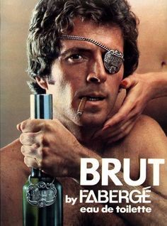
To gain further insight into brut I looked at the archive of advertising produced in the brands lifetime. This gave me a better understanding of the visual language they have used before and what works and what to avoid repeating.
Different brand adverts in the same market:
Concepts- The only work sent to me during the collaboration.
ideas:
At this point I didn’t have much enthusiasm for the project, but was hearing similar stories from my peers who were also taking part in the brief. I knew I couldn’t let this effect the way in which I would approach the project. The concept across the 3 tag lines was basically saying; why buy an expensive perfume that took you ages to find when he’ll forget what you bought him, you will get the same reaction and its something he will just call aftershave. Although i didn’t find the concept particularly bold it was what i had to work with. I experimented with a complete range of styles, aesthetics and different architecture for the layouts of the tag lines. I stuck to a typographic approach playing with different ways in which I could emphasise some of the wording. This was more of a struggle as some of the wording was very long making it hard to keep the attention of the audience. With this being the case, it was key to find techniques to highlight certain words, which I also experimented with.
Proposition 1:
Taking this forward, I didn't have time to discuss what ideas to develop so I chose 3 to take to the next stage. The first used simple bold typography on the company’s green colour background, this was then matched with a sliced out section of one of my photographic portraits, of a man smiling with a beard. This fitted in accordingly with the target market of the product, conveying it has happy users. I felt this concept could have worked well in different formats, allowing for different portraits and different section sliced out.
Proposition 2
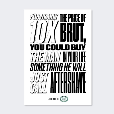
The second concept was to focus purely of typography, using a range of fonts to jump out at the audience, intriguing them to read the rest of the poster. This idea was inspired by cheap market stool posters offering deals. I felt this fitted really nicely with the concept of why buy something expensive ‘when u get this for way cheaper, and does the same job’. I also felt this was the most interesting and best opportunity convey the message in a captivating fresh way.
Proposition 3:
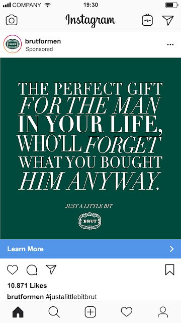
Finally, this approach was influenced by high end brands. Here I tried to create the vasad that brut is a really classy brand, using Baskerville, a serif typeface to connote this. This also intentional, taking the mickey out of itself, much like McDonalds I planned to a similar approach with this idea.
Developing ideas:
After discussing the concepts with my collaboration partner, she felt the third concept would fit the target market; middle aged women. Although I didn’t feel this was the strongest aesthetic for the concept I understood her direction I felt this could still work with development in the right way. Initially this idea had some imagery of the product. To really give the high end feel and aesthetic required to pull this look off I stripped it back completely. Using the older less in your face green as the background for the piece. I then went on to re jig the typography so the correct words were highlighted using bigger type. This gave the assets a much more professional and industry standard look through the use of colour and architecture of the type. My partner for collaboration was happy without the outcome. Saying this I was asked to turn this project around with a couple of days’ notice meaning I didn’t have time to develop like I would have intended to.
Production:
Dimensions to work to:
To put the assets into context I used mock-ups to place them into a magazine spread, a billboard poster and an Instagram post, as these were the requirements set on the original briefing. After leaving the project for a couple months I decided to revisit it as I felt it wasn't to a good enough standard and I remembered it feeling rushed due to the time pressures.
Revisit- Further development:
After analysing what went wrong I decided to take a step back and go back to a previous idea of using different typefaces inspired by market deal posters. This automatically warmed to me and I could see the potential for a lot of improving. To develop this idea I looked at how using too many fonts clashed and the layout was not clear or legible enough. To sort this out I decided on using different variations and weights of the same font; Druk. This created that market poster mood whilst bringing a contemporary feel the artwork. This was also more legible, and I carefully thought about placing of certain words to emphasise the concept. I used only back and white for the type, adding a block black background to some outlined words creating a 3d shadow effect also helping to highlight key words in the type. I feel the aesthetic really works well with the concept and delivers a punchy message which stands out, and would hopefully capture the audience’s attention.
Taking this project forward and the assets into production for the second time, I new I wanted these to work better as a set. Using mock-ups for the posters looked tacky before so I decided to give them a light shadow on the same colour background as the Instagram mock-up. I then went on creating a logotype of the campaign slogan: Just a lil bit Brut. These all looked consistent and doing them in square format was appropriate for uploading them to Instagram.
Evaluation:
The project was not as
successful as I would have liked, this was due to the lack of participation
from my collaboration partner. I was particularly disappointed when asking for
the research and idea development to not even get a response. Saying this after
creating for the work for her hand in, I then went on to develop the project.
This was a much more enjoyable part of the project as I was doing it for me,
not someone who didn't seem to care. I felt the outcomes were suitable and
effective. I was happy with the strong aesthetic and bold typography used to
create consistency across the campaign. This brief was unique and taught me
about dealing with people who don't work in the same way as me. Although
frustrating, these obstacles do occur and this was good practise for similar
situations that may happen in industry.


